Waterford FC introduces crest rebrand

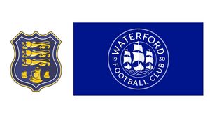
Waterford FC's old crest (left) compared to the rebrand (right) designed by graphic designer Christopher Payne.
Waterford FC introduced a rebranded club crest with the Déise’s famous three ships acting as the focal point of the new design.
The club’s founding year of 1930 is also given increased prominence on the rebranded crest.
The three lions present on the club’s current crest- which functioned as a callback to the Waterford Coat of Arms - have been removed.
The circular design is intended to offer a “modern-look” minimalistic feel.
“At our very first fans forum as owners one of the things highlighted by the fans was the desire to replace the Waterford FC crest – something we promised there and then we’d do,” said Waterford FC Chairman Jamie Pilley.
“We wanted to ensure this wasn’t rushed and a proper process was in place to capture the history of the city and the opinion of the supporters.
“It’s taken almost a year of different designs, meetings and debates to get to this point, as well as the fan vote which was incredibly important to us.
“There was one resounding winner in the vote and we are delighted with how it looks.
“We look forward to a new era of Waterford FC with a crest we can all be proud of.”
The crest was created by graphic designer Christopher Payne.


